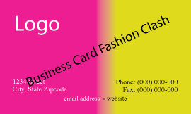
Business cards are the best form of advertising, but the most over looked in value on return and thought into the design. Most think just the company name and phone number will be adequate; yes those are key elements, but there is so much more involved in a business card and many key elements are overlooked, which there are 4 big business card mistakes.
The 4 big mistakes that are quite frequently made in business card design
1. Color – choosing the right colors for your company representation are a big part of your company and the colors say a lot about your company, goals, philosophies and your message. Color has meaning, makes a statement, it tells a story about your company and it can show strength. Color is power in the message you want to convey about your company.
2. Logo – designing the right logo to fit your company personality, style and credibility. Just in that small symbol / icon represents your company’s power and conveys a great deal to the person looking at the card for those few seconds. It takes 3 seconds once a person receives a business card to decide whether they want to do business with that company or keep looking to compare. Even the lines and shapes individually used to create the logo represent meaning and create a voice. The elements collectively within the logo, overall convey emotion, visual perception, and trigger a desire to want to know more about this company. The logo has many unspoken words, emotions, and messages. What does your logo say?
3. Font – often the font / typeset, which is your company address, phone, website, etc., are so small that a person needs a magnifying glass to read the information. It is as if a company is trying to do business incognito. This is self defeating, as you want your information to be read, no I am
not saying to make the font size extremely large, but make it a normal size, as to be easily read. After all, do you want the font to be so small that your reader throws the card the away, because it is unreadable?
4. Design – the overall attention grabber. This is really one of the biggest mistakes and the most over looked part of the business card. Some think the minimalist look is the best; you know, the one that has no logo, no color, small font / typeset, and screams boring. Then there is the design that is way over the top and is overbearing to the point you loose the reader, as to you company information or what your company is conveying. Another great mistake in design is what I call the “fashion clash” of business cards. This is where there is no color correlation to tie together the company with the logo, philosophy, information, convey strength or most importantly the message. It is as if there was no attention to detail, just
elements thrown together. So you can see design plays a very big part in attraction and what it conveys to the reader. What does your design say?
As you can see, all of these elements need to work together, flow, project the unspoken words about the company message, and philosophy. There is so much that goes into the design of a business card, but the most over looked, probably due to the size. Even though the card size is small, there is a great magnitude of power, voice, and message that comes from the smallest form of advertising a company can possible create, the business card.

